New Slot Based Storage System

So, I want to try to be nice about this and address it with nicer language than I have already heard others using in LOOC.

I know this is new, so maybe it can be improved.

But, my biggest problem with it so far is that I can’t figure out how to have multiple storage windows open at the same time. This is critically hurting how I play the game.

When I play as Sec or Chem I like to have my Backpack and Belt/Bag/Other Storage Thing open at the same time. I nest them in the top left of my UI so that I have quick access to both my large and small items when I need them.

For instance, as Sec, I can have access to my baton and cuffs from my belt while at the same time have access to a big gun from my backpack if I need it. If in Chem I can store Jugs in my backpack while having access to smaller things at the same time from my Chem Bag.

I can not figure out how to have two storage windows open at the same time in this new system and it is massively slowing my game play speed. I see this being a massive problem in Sec where switching between items quickly is the difference between catching someone or them getting away.

I tried to click the toggle in the Controls Option and my window disappeared entirely instead of undocking. I play 1360 by 768 on my futon on a TV that is across my room. My guess is that when I undock the storage display it is defaulting somewhere on screen outside of my resolution. Making it entirely inaccessible to me.

The easiest, perhaps kneed jerk, response that I and another person I spoke with already want is this to revert back to the older system.

But, if that’s not happening, what can we do to update this new system so that I can force it to mimic the functionality of the old system?

1: I’d say have the undocked storage show up somewhere on screen where I can actually see it.

2: Make it so that I can have multiple storage open at once. This is going to look awful in the center of the screen because it’s going to have to stack right up into the viewing range of my character. But, at least it would be functional unlike it currently is. If I can have multiple undocked windows that I can then nestle into the top left of my screen like I used to be able to; then I think I might be able to get used to the new system.

Is this already possible and I’m just not seeing it because my undocked storage spawns off screen? Or, is current storage now stunted to only opening one window at a time?
1 hour ago, EVIL_ED said:

2: Make it so that I can have multiple storage open at once. This is going to look awful in the center of the screen because it’s going to have to stack right up into the viewing range of my character. But, at least it would be functional unlike it currently is. If I can have multiple undocked windows that I can then nestle into the top left of my screen like I used to be able to; then I think I might be able to get used to the new system.

Is this already possible and I’m just not seeing it because my undocked storage spawns off screen? Or, is current storage now stunted to only opening one window at a time?

You should be able to have multiple things open. I believe it worked for me in the past with the new system, not sure why for you.

Ok, so I just did some more testing to confirm that this is indeed broken badly.

If I put on a medical belt and my backpack at the same time, the new system is broken and does not let me have them both open at the same time like the previous, better, system did. This is massive pain that makes navigating the UI a slow, clunky, and arduous process.

Arduous is a good word here.


"adjective
adjective: arduous

 involving or requiring strenuous effort; difficult and tiring."

Each and every word of the definition appropriately applies.

I honestly don’t mind the slot system itself. It’s kind of cool / cute and I can see why some people might like that.

If we can have slots and multiple open windows, I can be ok with this system.

If we cannot have slots and multiple open windows, I’d rather revert entirely back to the old system with multiple windows than the new system with slots.

An update to a UI is supposed to increase the control and options the player has with it; not decrease.

I was able to get the window to undock. I unchecked the static option in the controls before I enter the shift and then it worked.

But, I cannot figure out how to have more than one undocked storage window open at a time.

I keep trying, but when I open my belt it closes and replaces my backpack. When I open my backpack, it closes and replaces my belt. This is totally wrong and I deeply don’t like it at all.

I should be able to open my undocked backpack, nestle it up in the top left of my screen like I have always been able to do sense forever. Then, I should also be able to open my undocked belt and be able to nestle it up in the top left of my screen next to my already open and still open undocked backpack like I have always been able to do sense forever.

I taught myself how to play this game this way and I do not want to learn a new way to play this game just so we can have graphic slots. The old system worked perfectly already and we really didn’t need a slot based system. If we’re going to have a slot based system, it certainly shouldn’t come with a massive functionality downgrade compared with the previous system. This is a major step backwards and makes playing a massive chore.

Am I missing something? Or, is this functionality for multiple storage windows being open at once simply missing? Please fix or revert.

word. preach. Spitting actual bars.
Slot-based inventory took away my John Slime arc because it was so bad I quit midround.

Realistically, our characters have a good enough memory to know what items are in each inventory storage at once.
Enough of this Resident Evil bullcrap. It was cool at first, and then the headaches rolled in.

1 minute ago, Warentan said:

word. preach. Spitting actual bars.
Slot-based inventory took away my John Slime arc because it was so bad I quit midround.

Realistically, our characters have a good enough memory to know what items are in each inventory storage at once.
Enough of this Resident Evil bullcrap. It was cool at first, and then the headaches rolled in.

I didn’t know storage got another update and this shit looks fucking ass. I’ve never wanted to cry more in my life than now in this game. It’s literally the inventory system in unturned and it’s just crazy lmao

1 hour ago, EVIL_ED said:

Ok, so I just did some more testing to confirm that this is indeed broken badly.

If I put on a medical belt and my backpack at the same time, the new system is broken and does not let me have them both open at the same time like the previous, better, system did. This is massive pain that makes navigating the UI a slow, clunky, and arduous process.

Arduous is a good word here.


"adjective
adjective: arduous

 involving or requiring strenuous effort; difficult and tiring."

Each and every word of the definition appropriately applies.

I honestly don’t mind the slot system itself. It’s kind of cool / cute and I can see why some people might like that.

If we can have slots and multiple open windows, I can be ok with this system.

If we cannot have slots and multiple open windows, I’d rather revert entirely back to the old system with multiple windows than the new system with slots.

An update to a UI is supposed to increase the control and options the player has with it; not decrease.

I was able to get the window to undock. I unchecked the static option in the controls before I enter the shift and then it worked.

But, I cannot figure out how to have more than one undocked storage window open at a time.

I keep trying, but when I open my belt it closes and replaces my backpack. When I open my backpack, it closes and replaces my belt. This is totally wrong and I deeply don’t like it at all.

I should be able to open my undocked backpack, nestle it up in the top left of my screen like I have always been able to do sense forever. Then, I should also be able to open my undocked belt and be able to nestle it up in the top left of my screen next to my already open and still open undocked backpack like I have always been able to do sense forever.

I taught myself how to play this game this way and I do not want to learn a new way to play this game just so we can have graphic slots. The old system worked perfectly already and we really didn’t need a slot based system. If we’re going to have a slot based system, it certainly shouldn’t come with a massive functionality downgrade compared with the previous system. This is a major step backwards and makes playing a massive chore.

Am I missing something? Or, is this functionality for multiple storage windows being open at once simply missing? Please fix or revert.

I DID NOT know inventories were revamped again until now, so disregard my last reply. This is not good in my opinion, and being unable to have more ui’s open is crazy. Pure unturned stuff honestly. I liked being able to have more WT ammo in my HoS jacket and being able to store more in my belt. Honestly don’t know why this change was added.

i highly disagree with only 1 inventory open:

  • makes med engi salv annoying, sci kinda ok
  • sec is evil since you have to search 1 container at a time  and cant use your own belt/bag


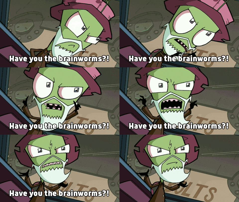
have-you-the-brainworms.gif

1 hour ago, EVIL_ED said:

Can someone please take this person off UI design for being poo brain?

Poo Brain is absolutely crazy, but to call having more than one inventory ui’s open degenerate? Even more crazy…

Though, I would love it if the change was reverted lmao. 

I can’t tell what’s worse: having the inventory the way it was with everyone resisting any change or people claiming any change is literally the worst thing ever that makes the entire game impossible

having infini-UI windows is just as bad. The only change this needs is so only top level inventory containers can be open (bags, belts, containers in your hand)

9 hours ago, EVIL_ED said:

Welp, sadly, just did some more research. I popped into discord, though I usually don’t like to (not a fan of discord) and realized multiple UI windows not being able to open at once was actually done on purpose.

What a stupid idea.

I have already canceled my Patreon… again. Which is frustrating because every time I get to a place where I feel like I like this game and where it is going something else happens to smack me in the face. Just a few days ago I called this my favorite game. Now the game in unplayable.

This is horrible. It’s going to make playing Sec, and Med impossible. I think I’m going to just leave the game for a little while because it’s not worth dealing with this nightmare. I’m not going to torture myself to play this game.

The person in charge called having multiple UI windows open at once “degenerate.” He also said it only lasted as long as it did because ‘they didn’t want to deal with the backlash.’ Which, of course, translates that they knew this is a change people wouldn’t like but did it anyway. Can someone please take this person off UI design for being poo brain?

you arent holding anything over anyone’s head by loudly proclaiming you are cancelling patreon donation due to your disagreement with a system change on a game in development.

you are bold to assume there is a “UI design team” to “take people off of”

aw hel naw

retired (I guess) contributor admin dun responded

2 hours ago, lonesoldier55 said:

you arent holding anything over anyone’s head by loudly proclaiming you are cancelling patreon donation due to your disagreement with a system change on a game in development.

Also yeah, Soldier’s right. You don’t have to say that over the change and all, that you’re cancelling your Patreon again. Sure,no more opening more than one inventories sucks, but there’s no need for you to cancel so quickly over this. Plus the last time you said that, DID NOT go so good for you.

I mean, it’s your choice though.

Surely this won’t turn into some full on argument though and another top 10 longest threads…


I didn’t mind the previous storage rework and I don’t mind the current grid storage, it’ll just take some getting used to. But a few tweaks, that in all likelyhood are already being/have been considered, that I hope the contributors add are:

  • Being able to open multiple grids
  • Add a number to stacks
  • Ability to rotate the grid itself
  • Quick swapping
     

3 hours ago, lonesoldier55 said:

having infini-UI windows is just as bad.

Maybe I’m failing to see the obvious, but could you elaborate on why having infinite UI windows is that bad? Is it powergaming? Does it lead to a bad user experience?
 

3 hours ago, lonesoldier55 said:

The only change this needs is so only top level inventory containers can be open

Do you mean disabling the ability to open nested storage while it’s nested, e.g. the inability to open a survival box while it’s inside a backpack?
 

3 hours ago, lonesoldier55 said:

you are bold to assume there is a “UI design team” to “take people off of”

You’re out of line @lonesoldier55, wait 'till HR hears about this.

2 minutes ago, Bundle said:

You’re out of line @lonesoldier55, wait 'till HR hears about this.

Woah. Whaddya mean by this? What’s the problem?

30 minutes ago, Bundle said:

I didn’t mind the previous storage rework and I don’t mind the current grid storage, it’ll just take some getting used to. But a few tweaks, that in all likelyhood are already being/have been considered, that I hope the contributors add are:

  • Being able to open multiple grids
  • Add a number to stacks
  • Ability to rotate the grid itself
  • Quick swapping
     

Maybe I’m failing to see the obvious, but could you elaborate on why having infinite UI windows is that bad? Is it powergaming? Does it lead to a bad user experience?
 

Do you mean disabling the ability to open nested storage while it’s nested, e.g. the inability to open a survival box while it’s inside a backpack?
 

You’re out of line @lonesoldier55, wait 'till HR hears about this.

Yeah, you are mostly right.

Infinite storage UIs leads to existing strategies of having every nested storage container open at once. This enables frankly silly things like having the contents of multiple pill bottles buried within several containers instantly accessible on a moment’s notice. I am of the opinion that storage should be an ability to carry more things at the cost of needing to manage ypur inventory and consequently have to “find” things if you don’t manage it appropriately. Initial UI window iterations allowed any container anywhere on the player to remain accessible which led to a lot of silly things.

As far as top level containers, yes, I think nested containers shouldnt be accessible, but multiple containers “on your body” (belt, plausibly small bags like satchels, containers in your hand) should be accessible. These items provide that convenience instead of being merely storage items.

pre reworks the meta was no nested storage except when it increased capacity (pill canisters) or for secrecy (hiding disk from the fishops in 6 nested items, or stolen items) since you gain nothing from it

It does sound like some people were taking nested containers in a really deep way. I can see why this is some of what was trying to be addressed with the new rework.

All I really miss is the ability to have two main storage things open at once. Like a (belt/bag/second backpack in my hand when I was changing into Chameleon cloths) and my regular backpack.

SS14 has so little room in either of these things (even before the slot rework) and the game is very fickle about what’s allowed in one type of storage or another. Only certain things can go in a belt. Only certain things can go in a bag.

Being able to have both my belt and my backpack opened at once allowed me quick access to whatever was in either of them as well as an easy visual way to understand transporting items between them.

It feels very clunky to have to manually keep moving my mouse all over the screen to keep clicking one, then the other, then the other, then the other again to keep switching between both windows.

I avoided this in the past be simply keeping both open at basically all times in the top left of my screen. But, now I can’t do that anymore.

I really don’t know what to do about this except complain.

Is there no way to combine the two into the main storage window?

Like, if you open your storage inventory window and you have a belt on you could then see both your backpack and belt contents at the same time? If everything is supposed to be one window now. Why not have it be one divided window that shows both the belt and the backpack at the same time?

That way we’d have access to both things at once. This would fix two problems.

1: Being able to clearly see what is in both at the same time. As well as being able to move things between them easily because we can see what’s in both at the same time.

2: Being able to have ‘both open’ at the same time so we can fetch whatever we need at a moments notice.

I couldn’t imagine playing Sec like the system is now. Chem would be much more difficult and cumbersome, but doable. Certainly a metric crap ton of unnecessary clicks to keep switching between the bag and the backpack. But Sec would just be a nightmare.

I couldn’t imagine being mid-chase and not having access to both my backpack and my belt at a moments notice. I also couldn’t imagine trying to search and jail someone with this current limitation.

While I don’t play a lot of Engineering myself, I have already heard Engineering complaining about how difficult their job is now.

I can see why the devs don’t want people nesting storage, inside storage, inside storage, inside storage. But, being able two open at once, the two main ones in most cases, is something a very large amount of people use to play the game.

I don’t want to play Sec right now and then get yelled at / mocked because someone got away from an arrest because I couldn’t figure out how to switch back and forth between my backpack and belt fast enough. Even though I shouldn’t have to.

I hesitate to play Chem and have to deal with the nightmare of trying to constantly move Beakers, and Jugs, and other things between my bag and my backpack without being able to see the two spaces visually at the same time.

I am trying to be more calm in this reply than in my last two. But, this change is not a good one and it is adversely effecting how I am many others prefer to play this game.

Honestly, I’m being a lot more civil than the people are being in Discord and in Liltenhead’s Youtube video on the subject.

I’m not even complaining about ‘storage tetris.’ I don’t honestly mind the slot grid system itself. What I mind is that I can’t even have a belt and a backpack open at the same time.

Feel free to contribute and help existing developers iterate on the UI until we get a system most people are happy with.

18 minutes ago, lonesoldier55 said:

Feel free to contribute and help existing developers iterate on the UI until we get a system most people are happy with.

Well, what’s also difficult for me is it’s not an easy thing to even open the backpack and belt in the first place.

Granted this is more of a specifically me thing, but I usually play with my computer hooked up to my TV on a keyboard and mouse while sitting on my futon at a proper viewing distance from my TV.

Because of this, the UI buttons for opening these two are these tiny little squares in the bottom right hand corner of the belt and backpack icon. My visual from across the room makes these little buttons about the size of a Lady Bug.

As you can well imagine, I’m very likely to just take my entire belt or my entire backpack out of it’s inventory slot and into my hand by accident because the entire tile will move it to my hand but the little tiny button the size of a Lady Bug is what opens it.

I’ve never complained about this before because I’d just open both and keep them open on my screen at all times so it never became an issue previously.

Having to constantly switch between the two brings the issue to the surface in a painful and acute way. It goes from being a small annoyance at the start of my shift to being a problem that now haunts me through my entire shift.

Let’s say I’m Sec and I need to quickly access a big gun because I realize I need to use lethal instead of non-lethal. Before, I had both windows open (my belt and my backpack) and I could just go click on the big gun.

Now, if I have my belt open, mid-chase, I’m going to have to try to land a click on a small little button next to my backpack that appears to me sitting across the room as the size of a Lady Bug.

What’s going to happen? I can tell you. Mid-chase, while the evil doer is getting away, I’m going to miss-click and take my entire backpack out of it’s inventory slot and into my hand like a fool.

Even if that doesn’t happen, that’s still me having to navigate a chase with the WSAD keys while moving my mouse around screen all frantic trying to switch over between my belt and my backpack. Before I could just click on the gun. Now I have to aim for the Lady Bug size button with an extra, unneeded click mid-chase and then click again to fetch the gun out.

If the storage pop-up window could display the contents of both my belt and backpack at once; it would solve this problem. Maybe have either a vertical or horizontal line split in the grid window so we can tell which side is which thing.

Skill issue. Reorganize your storage to work for you instead of insisting on using a way that isn’t working and/or contribute what you think is a better UI system.

30 minutes ago, lonesoldier55 said:

Skill issue.

IMG2667.jpeg